Sindroms – Obsessed with colours


When you open Sindroms magazine, you experience ‘a journal of monochrome states of mind’. What does that actually mean? Superficially, you can describe Sindroms as a magazine about colour, but there is certainly more to it than that. ‘We knew from the beginning, that each issue will be only in one colour, and it’s going to be pretty intense,’ Miruna starts, ’we knew it’s going to be crazy to immerse into this one colour at a time. We really wanted to give it a name, that somehow shows that obsession you are going to have with each colour, and which explores the obsessive compulsive disorder of organising things by colour. That’s how we associated it with a syndrome.’
In the ideation process they quickly found out that colour can strongly affect one’s mood. This take on colours is exactly what became a diffracting factor for them: discovery became an inspiration for the editorial line and the flow of the magazine. ’We try to find subjects or common feelings, that people can relate to, and we try to touch upon themes that are universal. So even though the experience itself is very personal, it’s how you associate it with the colour,’ Monique explains.
This way, besides holding in your hands a carefully and beautifully curated publication touching themes like art, architecture, design and fashion, you can spot a lot of play around the meanings, symbolism and feelings connected to the colour itself.
Sindroms wouldn’t be the same staying in an online world. Offering the tactile experience to their readers became one of the goals. When asking for advice before launching, they heard many times, that print is dead. Anyways, they decided to do their own research and dive into the topic. “There is something really special with print. You can have it, put it away and come back to it. You can also feel it over time, and maybe you change your perspective over time. We thought that all this kind of different feelings related to physical object were beautiful. We also wanted to get away from being online all the time. It was also just a good excuse to create our own freedom through the magazine,” Monique explains, and Ana follows, “It really requires a lot of introspection and time with yourself and being with that object by yourself on the couch or wherever you feel comfortable and just going into it without other distractions.”
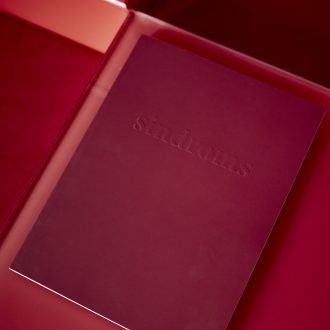
Chapter I: Red
Their journey from idea draft to print wasn’t easy. Lack of contributors was one of the obstacles they met during working on the first release, before having something they could show. Things started to take shape when they asked Ausra Babiedaite, one of the contributing photographers, to join the team as well. Launched in 2017 and funded completely by the two founders, the red issue made a lot of noise on the international publishing market and was widely covered in international media.
Why did they decide to start with red? What is so special about this powerful and extreme colour? ’It was safe for us.’ Kotryna says straightforward and looks around, ’You are not going to avoid it. All the warning signs are red. So many emotions from love to anger, are associated with red. It was a perfect colour to show people what we are about, and what we want to communicate. It would have been totally different, if for example we would had chosen neon green and tried to communicate our concept through that.’
Various meanings of red arise from the strong symbolism attached to the past. During the ancient era, in Egypt, red was a sign of health, life and victory. After the fall of the Western Roman Empire, red became a colour of majesty and authority, as well as a symbol of Christ’s blood in Western cultures. Even until these days it accompanies big events and celebrations. As many meanings it can possess across different cultures, Sindroms focuses on the introspection of the universality in how we feel about it. Besides the mentioned love and anger, the states of mind that the creators take us through are the states of violence, fury, risk and passion.
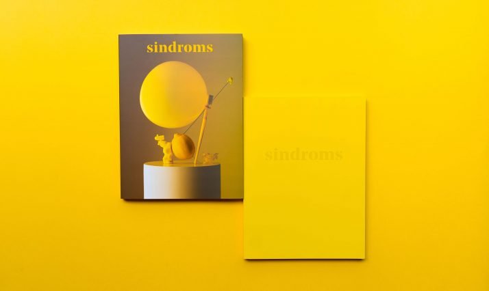
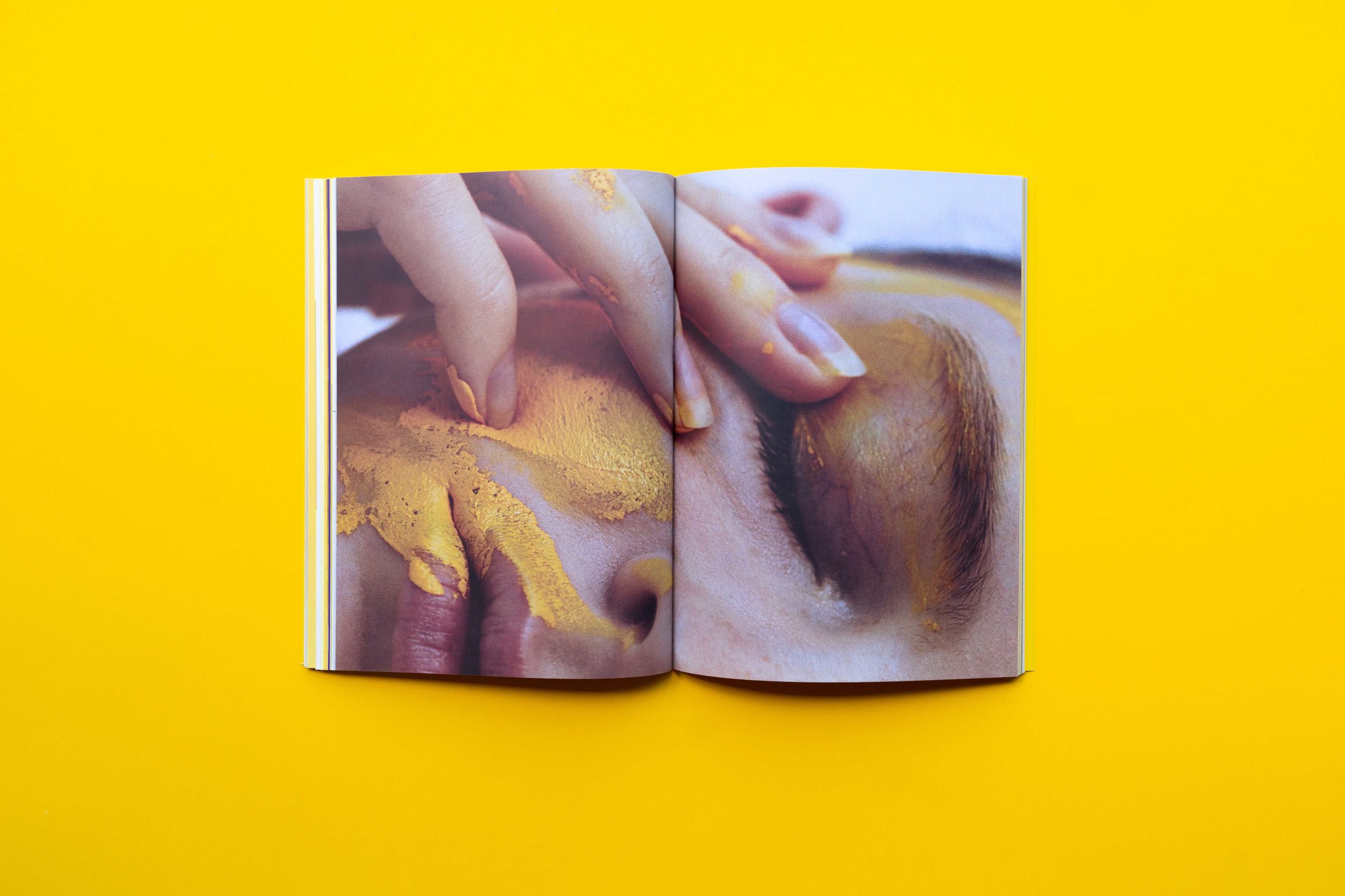
Chapter II: Yellow
Jealousy, happiness, cowardice, anxiety, friendliness and optimism. The second, and so far the latest issue, became yellow, following a theme of primary colours. ‘Happiness is obviously a big part of it, but there is also a dark side to that, the pressure of appearing happy everyday.’
The approach to the logistics also changed. To fund it, they decided to take it to Kickstarter. “What went through my mind was – it will show that we need money. Will it have an impact on the brand? What happens if we don’t get the money? All these questions were on our mind. We just challenged ourselves and said let’s do it,” Ana talks about their initial feelings. It was a big challenge for them to prepare the campaign within a few weeks, since working on Sindroms became a second full time job. Other issues that naturally appeared were how to cooperate in the team and how to make the process still enjoyable.
One of the rewards of the Kickstarter campaign was a colour themed yellow dinner. For that, they teamed up with the food studio Sweet Sneak. “Sindroms is not only a print magazine, it’s also about making people experience the colour, and the print magazine is just one of the ways we can do it,” Miruna adds.
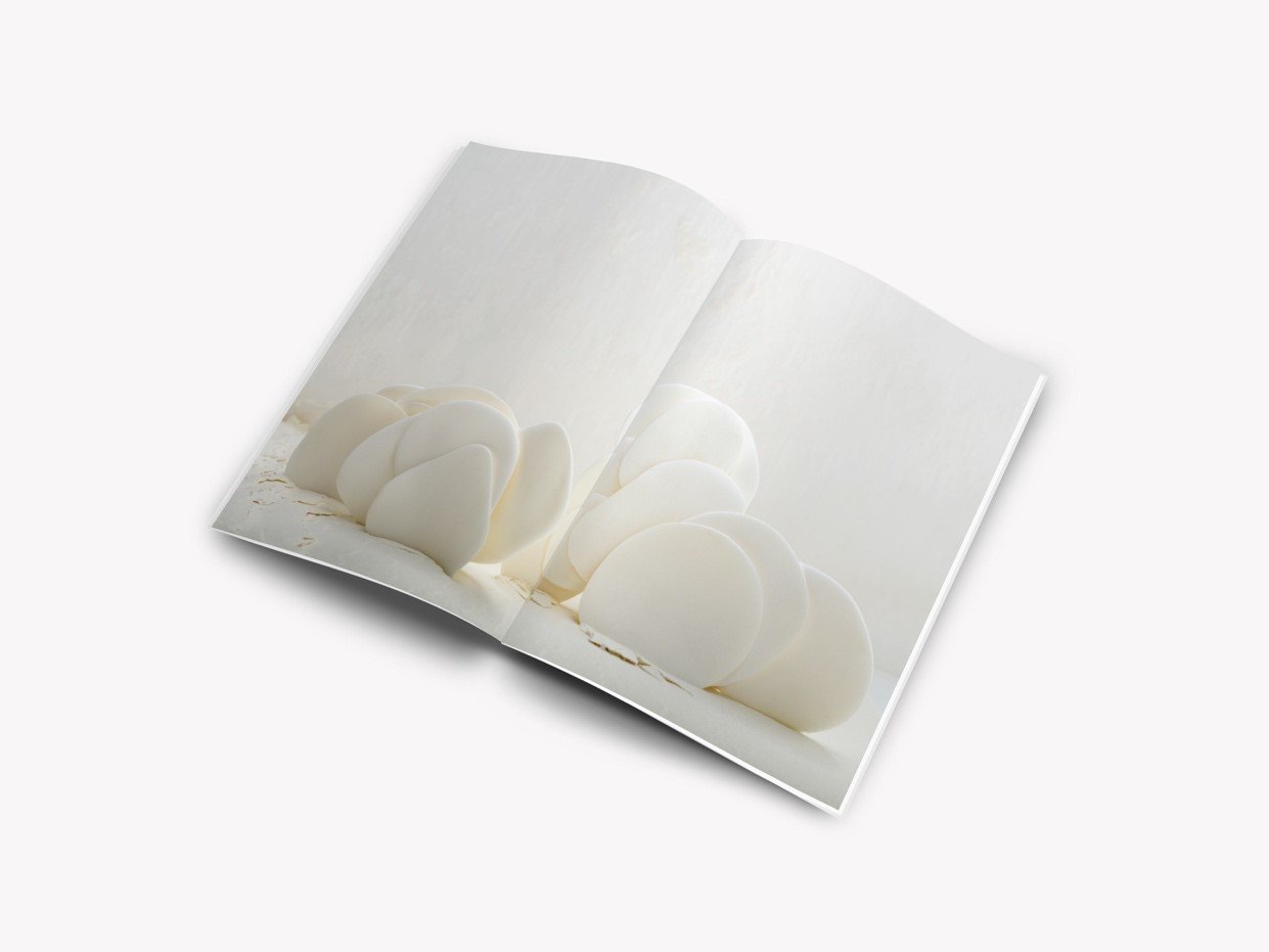
Chapter III: White
’I just realised that we are not wearing any colours today, we are all wearing white!’ laughing, Monique said as one of the first things in our conversation. And here is a bit of a plot twist considering the upcoming changes for their magazine.
In the past months, a lot of interest surrounded the choice of the next colour, with many speculating it was going to be green or blue. We now know that the upcoming third issue will be white – a colour that has long been on the team’s wishlist. It is definitely a big upcoming challenge, considering possible difficulties in printing and creating something exciting. Ana stays positive: “I think this will also be part of the beauty.”
What can we expect from the third issue, to be released in February 2019? The magazine’s editorial line will develop, having a new structure. “We are going to add more layers into the way white is perceived”, she paints the picture. ‘After working with very intense colours, it was about time to challenge ourselves and our readers’.
The white issue will be available to pre-order at the end of November, being released on February 1st 2019. Visit the website of Sindroms magazine www.sindroms.com, where you can buy all the issues.
On Instagram www.instagram.com/sindroms_they update the readers with more of the insights behind the stories from the printed matter.
Karolina Sikorska interviewed Sindroms.